Illustrator has a graphing tool that allows you to make Column and Pie charts along with some other garden variety data graphs for representing data visually. But the default results are pretty lackluster. Today, we'll take a look at the Graph Designer and some ways to make your data aesthetically pleasing and easy to read. (Check out
these tips on better graph design.)
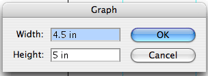
We'll start out by creating a simple column graph. Click on the Column Graph Tool and either click and drag or click to start the graph. If you click once, you're presented with the Graph dialog that asks you how the dimensions of your graph.
Once you decide on a size a generic graph will be created with only 1 data point and the data sheet palette will appear. It's a simple spread sheet application.
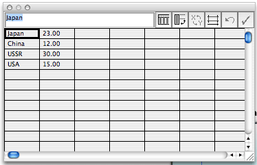
You can create your own data or import data from Excel. Here, we'll use the data sheet to enter the data for our graph. Enter the following in the manner in which it appears here:
Japan |
23.00 |
China |
12.00 |
USSR |
30.00 |
USA |
15.00 |
A few things about the data sheet palette. The first button allows you to import data from an Excel spreadsheet. The second button allows you to transpose the data. The third button allows you to switch the X and Y axis. The fourth button allows you to modify the cell style. Click this button and set the Number of Decimals to 0 and click OK. The fifth button allows you to Revert any changes you've made to the data (Undo). The last button commits the data to the graph. Any changes you make to the sheet won't visually update until you click this checkmark icon.
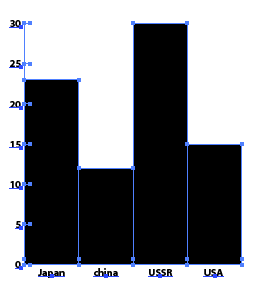
Go ahead and click on the checkmark icon to commit the data and close the data sheet palette. You can always access and change the data from the Object menu (Object > Graph > Data). The generic looking graph that results isn't anything to look at.
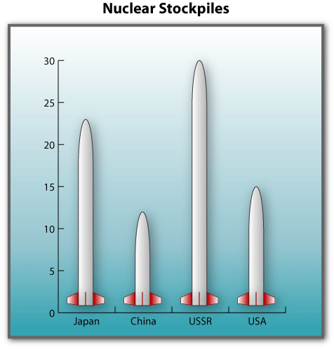
With a Graph Design, you can create your own element that will replace the rectangular columns that you see now. This makes the columns more relevant to the data. In our example, the data we are trying to express is the nuclear stockpiles of the countries listed in the data sheet. Instead of rectangles, wouldn't missiles make more sense?
Keep in mind when designing your column graphic that there are 4 types of column types that the graph can use:
- Vertically Scaled
- Uniformly Scaled
- Repeating
- Sliding
We will be creating a column that is sliding because vertically and uniformly scaled produces unpredictable results. Repeating columns would stack the same design one on top of the other and each unit would represent some value. The fractional data in a repeating column can either be scaled or chopped.
The first thing we need to create is a bare rectangle that sits in the background and serves as the boundary for our column. If you want horizontal space between columns, you can build it in by making the rectangle slightly wider than the object. If you're not sure what the object is going to be, you can always draw the rectangle afterward and then send it to the back. Be sure the rectangle has no fill and no stroke, unless you want to see it in the graph.
Then you can start making your missile inside the rectangle. In order to set up a sliding column, you need to make a reference within the object where it will break and slide from. You do this by drawing a line with the line or pen tool through the object. Then convert it into a guide (View > Guides > Make Guides). Be sure the line extends outside of the object and overlaps the rectangle. Then select all of the elements in your design, including the rectangle and group them Command (Control) + G.
Now go to the Object menu to Graph to Design.
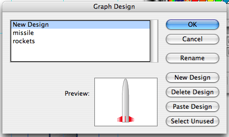
You can create a new design. Click Rename to give it a new name, I called mine missle, then click OK. Then go the Object menu to Graph to Column. Choose your Column Design from the list and set the Column Type to Sliding. Click OK and the graph updates with your design. Unfortunately, and hopefully there will be in the future, there are no preview options. Much better than bland rectangles!!!
To make things look even better, grab the Group Selection tool, it's under the Direct Selection tool. Everything in the graph you generated is grouped by default. If you were to ungroup these elements, they would lose context with the data. Keeping them grouped means that a change in the data changes the graph. Make sure nothing is selected by clicking away from the graph. Then click on the first missile. It's the only one that will be selected. Click on the same missile again and that data unit, represnted by the missile, is selected. Click on it one more time and the other data units or missiles will be selected.
With the missiles selected, go to Effect > Stylize > Drop Shadow. Turn on the Preview option and make adjustments to the Opacity, Offest, and Blur. Then click OK. Draw a rectangle around the entire graph. Give it a thick, dark gray, 4pt stroke and fill it with a sky gradient. Send the rectangle to the background or put it on its own layer and then move that layer beneath the graph. Add the title "Nuclear Stockpiles" above the rectangle and center it. As a final touch add a thinner drop shadow to the rectangle.
If you go back to the Object menu to Graph to Column, change the Column type to Repeating. Then set a scale value. I chose 10. Click OK and see how your graph changes. Now each missile represents 10 million nukes or whatever you deem the value to be. In the For Fractions section of the same dialog box, you can choose to scale or chop your column design.
Try changing the column type to vertically scaled and then uniformly scaled. You'll see what I meant by unpredictable. For good examples of graphs, check out the graphs in USA Today and the New York Times. Remember that the data should be easy to extract from its visual presentation.